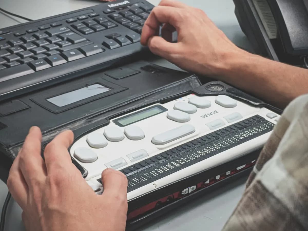
Google DeepMind introduced a sign-language-to-text model on August 12, bringing ASL dictation to Gboard and Live Transcribe on Pixel 11. The announcement is a useful reminder that conversational AI includes people who type, sign, speak, zoom, dictate, switch devices, and use assistive technology.
A website chatbot should support those routes before it claims to improve access. Run this checklist against the deployed widget, not a design file or isolated component.
| Test | Pass condition | Fast manual check |
|---|---|---|
| Launcher name | A screen reader announces purpose and state | Inspect the accessibility tree, then open and close it |
| Keyboard route | Every control works without a pointer | Complete one conversation using Tab, Shift+Tab, Enter, Space, and Escape |
| Focus handling | Focus enters the chat, stays predictable, and returns to the launcher | Watch the focus indicator through open, send, error, handoff, and close |
| New-message announcement | New replies are announced once, without stealing focus | Send three messages while reading elsewhere in the transcript |
| Zoom and reflow | No control or message is lost at a 320 CSS pixel viewport | Test the page and open widget at narrow width and high zoom |
| Target size | Controls are at least 24 by 24 CSS pixels or have enough spacing | Measure launcher, send, close, attachment, and suggested-reply targets |
| Error recovery | The error is announced and the draft remains editable | Disconnect the network during send, then retry |
| Human handoff | The user can request help and receives a clear next step | Trigger handoff with keyboard and screen reader only |
Passing an automated scan is useful, but it does not prove that a conversation makes sense. Chat widgets change while the user interacts with them. Messages arrive, typing indicators appear, suggestions are replaced, and focus can jump. The important failures live in that sequence.
Test a complete conversation, not eight separate controls
Start with the real entry point on a representative page. Cookie banners, sticky navigation, support launchers, and mobile browser chrome can collide even when each component works alone.
Use a short task with a known outcome:
Find the return window for an opened item, ask one follow-up question, and request a person if the answer remains unclear.
Run it four ways: keyboard only, a desktop screen reader, 400 percent browser zoom, and mobile touch with increased text size. Keep the question and expected answer constant. That lets you compare interaction failures without confusing them with answer-quality changes.
Record the browser, operating system, assistive technology, viewport, widget version, and result. "Screen reader works" is not a reproducible test result. "VoiceOver on Safari 20.1 announced the assistant reply once and left focus in the message field" is.
If the chatbot is embedded on several site builders or frameworks, repeat the route on each host. An embed can inherit clipping, stacking, font, or focus problems from the page around it. The website chatbot embedding guide covers the installation routes. Accessibility testing must happen after the embed is placed in its final page shell.
Worked example: hear the broken interaction
Consider this screen-reader transcript from a support widget:
Button, unlabeled
Blank
Edit text
Customer: Can I return an opened coffee grinder?
Sending, alert
Sending, alert
Typing, alert
Typing, alert
You can return unopened products within 30 days.
Edit text
The interface is technically present, but the experience fails in several ways. The launcher has no name. Opening it produces no dialog title. Status messages repeat. The assistant answer does not identify its speaker. Most importantly, the reply does not address the customer's use of "opened."
A useful expected transcript looks like this:
Open support chat, button, collapsed
Support chat, dialog
Messages, region
Message, edit text
Sending message, status
Support assistant: I found the standard return policy, but it does not
state whether opened grinders qualify. Would you like me to connect you
with the returns team?
Message, edit text
The fixed version gives the launcher an accessible name, names the dialog, identifies the live transcript, announces one short status update, labels the speaker, and returns focus to the input. It also preserves uncertainty in the answer. Accessibility and answer quality meet in the same conversation.
Do not treat the wording above as a universal screen-reader script. Different browser and assistive-technology pairs announce roles differently. Define the information that must be conveyed, then verify that a real user can hear it in a sensible order.
Make the keyboard route boring
The keyboard route should have no surprises. The launcher enters the normal tab order. Enter or Space opens it. Focus moves to a useful element inside. Tab reaches the transcript, input, send control, attachments, suggested replies, handoff, and close control in a logical order. Escape closes the dialog when that behavior is offered, and focus returns to the launcher.
The W3C dialog pattern describes the expected focus loop for modal dialogs. If your widget is non-modal, do not label it modal or trap focus inside it. Pick the interaction model first, then make the roles and behavior agree.
Test state changes as well as the happy path:
- Open the widget, close it immediately, and open it again.
- Send a message with the button and with the keyboard.
- Traverse a long answer containing headings, lists, and links.
- Activate a suggested reply, then edit the populated text.
- Cause a validation error, a network failure, and a rate-limit response.
- Request a person, cancel once, then complete the request.
Keep a visible focus indicator throughout. Check that a sticky composer, cookie banner, or mobile keyboard never hides the focused control. A focus ring that exists behind another layer does not help anyone.
Announce changes without reading the whole chat again
Chat interfaces need live updates, but a single broad live region often becomes noisy. Appending one message can cause the screen reader to repeat the transcript, timestamps, buttons, and citations.
Use announcements for compact state changes. Keep long answer content in a structured transcript that the user can navigate at their own pace.
| Event | Announcement | Avoid |
|---|---|---|
| Send starts | "Sending message" when delay is noticeable | Repeating it on every render |
| Reply starts | Optional brief typing status | Moving focus to the indicator |
| Reply completes | Speaker plus new answer, once | Re-reading conversation history |
| Send fails | Error and recovery action | A visual red border with no text |
| Handoff starts | Destination and expected next step | "Success" with no operational detail |
WCAG's guidance for status messages warns that live regions can make an application too chatty. Test with streaming enabled. A chatbot that adds one token at a time may trigger dozens of partial announcements unless the accessible update is buffered.
Do not move keyboard focus to each new answer. That interrupts typing and makes it hard to review an earlier message. A brief announcement can report the arrival while focus stays in the composer. The user can move into the transcript when ready.
Stress the box at zoom and on small screens
Chat widgets tend to use fixed heights, fixed launch positions, and sticky composers. Those choices break when text grows.
W3C's reflow guidance uses a 320 CSS pixel-wide viewport for horizontally written content, equivalent to a 1280-pixel-wide browser at 400 percent zoom. At that width, verify that:
- the close control remains visible;
- message text wraps without horizontal scrolling;
- code, links, and long order numbers do not push the panel wider;
- the composer does not cover the latest message;
- error text remains next to the field it explains;
- suggested replies wrap or scroll without hiding their labels;
- the host page does not place another fixed control over the widget.
Run the same checks with browser text enlargement and operating-system text settings. A responsive mobile screenshot at default text size cannot substitute for either test.
Measure interactive targets too. WCAG 2.2 sets a 24 by 24 CSS pixel minimum at Level AA, with defined exceptions for spacing and other cases. Small icon controls often fail first: close, send, microphone, attachment, copy, feedback, and carousel arrows. The visual icon may stay small while padding enlarges its clickable area.
Grade the answer as accessible content
The widget can have perfect focus management while the model returns unusable material. Include answer structure in the test set.
Ask for instructions, a comparison, a policy answer, a phone number, and a multi-link response. Check that headings follow a meaningful order, lists are real lists, link labels identify their destination, and tables have headers. Avoid walls of text that depend on bold styling alone.
Test generated controls separately. If an answer creates buttons, forms, cards, or selectors, those controls need names, states, keyboard behavior, validation, and stable focus. The generative UI safety guide explains why generated interface intent should map onto reviewed components instead of raw model-authored markup.
Include ambiguity in the prompts. "I cannot see the verification code" may describe a missing email, low vision, screen magnification, or a broken page. The chatbot should ask a useful clarifying question rather than diagnose a disability or send the user through irrelevant steps.
Keep the handoff accessible after the bot stops
Accessibility cannot end at escalation. A handoff that opens an unlabeled third-party form, removes the transcript, or demands a phone call can erase all the work the customer just completed.
Test the whole transfer. The chatbot should state where the request is going, which details will be shared, what the user must do next, and what response time the team can actually support. Preserve the draft if submission fails. When the transfer completes, announce the result and leave the confirmation available in the transcript.
The handoff packet should carry the customer's question, relevant answers, unresolved point, and accessibility preference only when the user chooses to share it. The chatbot handoff routing guide provides a field-level routing pattern that avoids making the customer repeat the case.
Ship with evidence, then keep listening
Set a release gate that names the supported browser and assistive-technology combinations. Require a complete task on each route, plus automated checks for common markup errors. Save the manual transcript, screenshots at high zoom, failed steps, and fix owner with the release record.
Automated tools catch missing names, contrast failures, and invalid relationships. They do not tell you whether streaming speech is coherent, whether the focus order matches the conversation, or whether a handoff leaves someone stranded. Include disabled users in research and paid testing. Their results should change the backlog, not decorate a compliance report.
The best accessibility test is a conversation completed under real constraints. Test the opening, the changing transcript, the answer, the failure paths, and the transfer as one route. A chatbot becomes more useful when every customer can reach the same outcome without fighting the interface.
No credit card required.